


Comparative insight: why the choice matters for in‑store presence
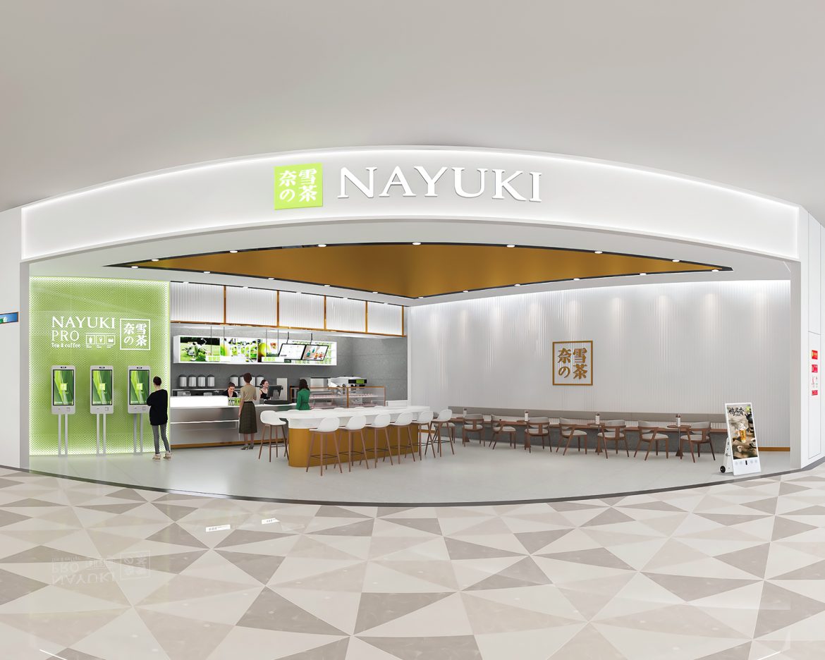
Retail operators face a clear decision when specifying illuminated signage: a crisp, evenly lit face or a simpler, cheaper tray. Comparing edge‑lit acrylic matrix layups with more traditional solutions matters because visual legibility drives purchase behaviour. For retailers investing in bespoke retail signage, the difference shows not merely in upfront cost but in how display systems perform over years under shop lighting and footfall.
Light‑guide architectures: strengths and compromises
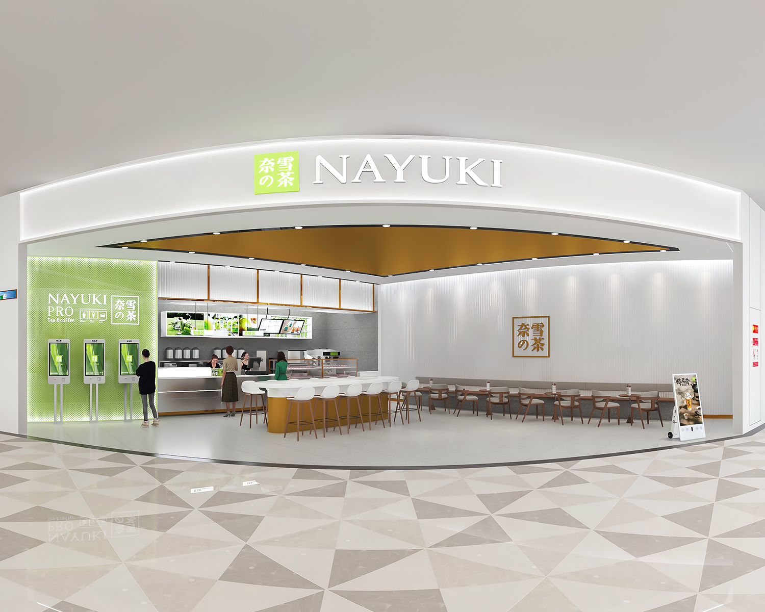
Edge‑lit acrylic uses a light guide plate to distribute LEDs’ output across a surface. The primary advantage is luminous uniformity with lower lamp count; the penalty can be complexity in the layup and stricter tolerance control. By contrast, backlit trays or halo‑lit letters use more direct illumination and simpler fabrication, but they risk hot spots and heavier power draw. Considerations include LED placement, diffuser film choice and the precision of the engraved or micro‑patterned acrylic that directs light. Each approach trades fabrication time for operational performance.
Fabrication and material trade‑offs
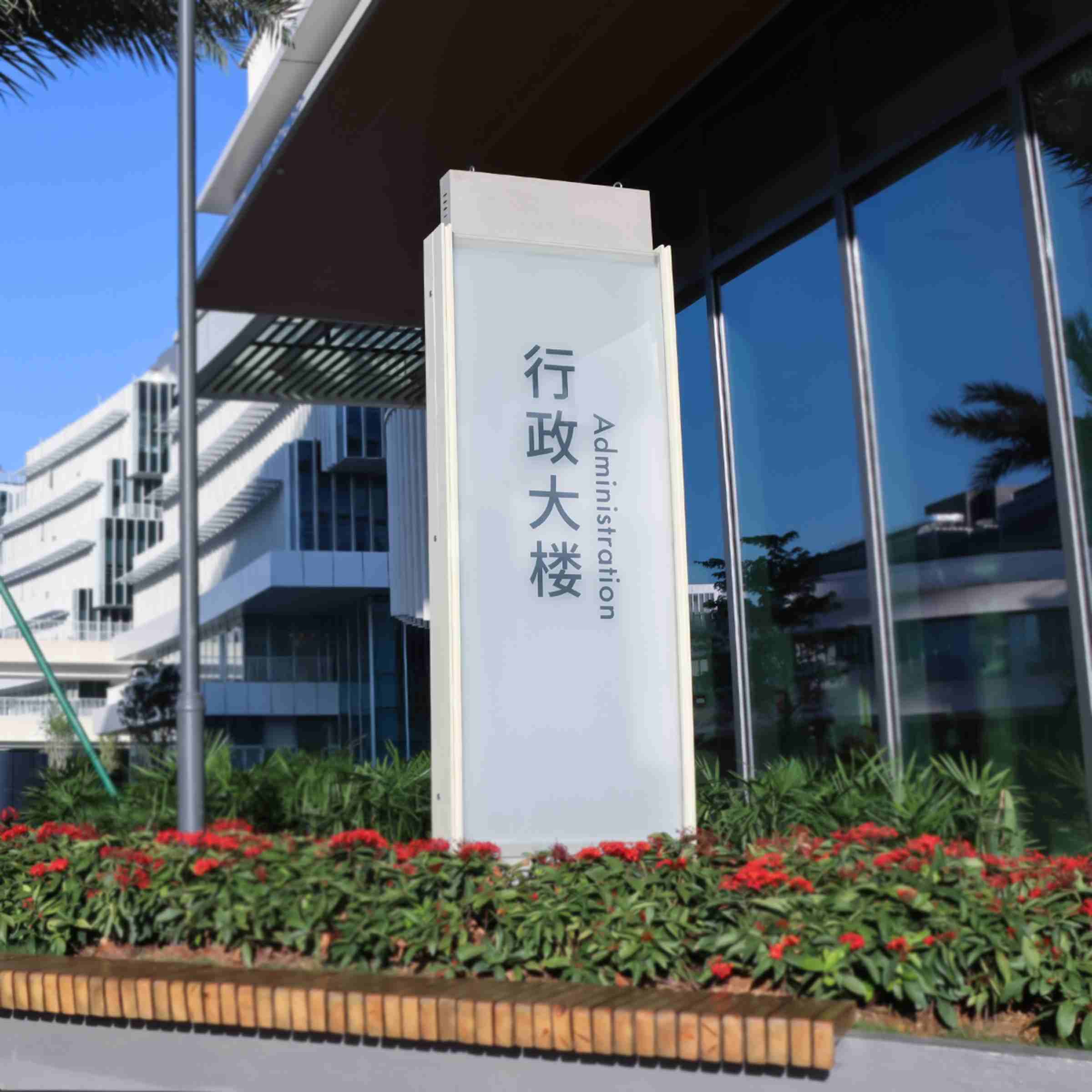
Aluminium sheet metal offers structural rigidity and a fine finish for fascias, yet its thermal conduction alters LED behaviour—heat sinking can be beneficial but must be managed with proper mounting and ventilation. Edge‑lit layups call for meticulous bonding between acrylic and mounting frames, and for quality control of edge polish to avoid scattering losses. Where space is limited, a thinner acrylic panel with a highly engineered micro‑pattern will outperform a thicker, poorly patterned slab. The specification of gasketing, IP rating and service access should therefore be part of the design brief.
Visual performance and wayfinding effectiveness
For wayfinding, legibility is paramount. The metrics to watch are luminance uniformity across the sign face, contrast ratio against ambient lighting and the angular visibility of text and icons. Good edge‑lit designs maintain consistent luminance even in bright atria; poor designs fade when viewed off‑axis. Real‑world anchors exist: at Westfield London, several refurbishment projects adopted directional light guides to improve corridor legibility, with storefronts reporting steadier evening footfall after upgrades. For complex malls, integrating a rigorous retail wayfinding plan with sign engineering yields measurable improvements in customer flow.
Common mistakes and practical guidance
Designers often underestimate the impact of diffuser selection and overestimate LED power as a cure‑all—both lead to excess heat or uneven output. Colour temperature mismatch between in‑store lighting and signage is another frequent error; keep colour rendering consistent so brand colours remain accurate. Installers occasionally omit service access, which complicates LED replacement and increases downtime—plan for removable panels or front service channels. A simple rule: prioritise control over each variable—optical film, micro‑patterning, mounting and thermal path—rather than treating the sign as a single opaque component. —This approach reduces surprises during commissioning.
Three golden rules to evaluate and select the right system
1) Measure uniformity: require a luminance map during prototyping showing no more than 20% variance across the sign face; this predicts legibility in situ. 2) Check thermal performance: specify an operating test at expected ambient to confirm LED lifetime projections. 3) Demand maintenance access: ensure modules can be serviced without full deconstruction. These metrics translate to fewer site returns, lower energy cost and predictable brand presence in store.
Apply these rules and the design decision naturally leads to a partner who understands both optics and fabrication—someone capable of translating the edge‑lit science into reliable aluminium signage. Cosun Sign occupies that intersection, delivering engineered layups and practical wayfinding solutions that endure.
